So much architectural criticism today is based on subjective impressions that it can be easy to lose sight of the fact that there are some basic, objective laws which command our respect in the design of buildings. If we contradict or ignore them, our designs risk looking unnatural and ill-fitting to their purpose, or worse, unintelligible. Since common sense is so uncommon these days, particularly in this field, I think these laws bear stating plainly.
First Law: Symmetry Suggests Movement Along an Axis
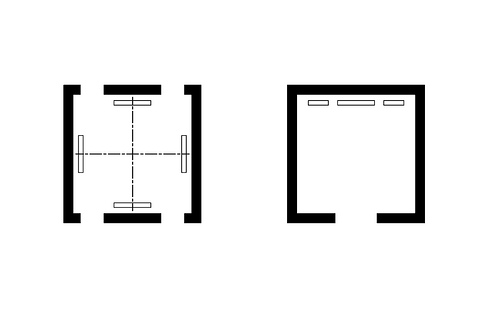
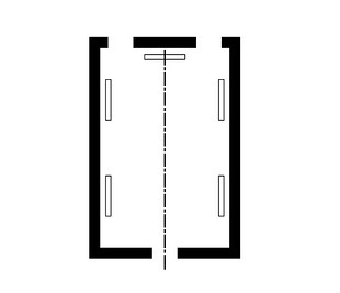
The plan diagram below summarizes the point, that processional avenues are created when objects are symmetrically disposed about a path. The objects can be anything: houses, columns, trees, statues, etc.

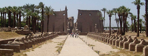
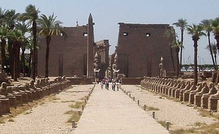
Here is perhaps the most famous example of the First Law in action, the Avenue of the Sphinxes at the Luxor Temple, Egypt.
The symmetry is so powerful, one feels compelled to march solemnly down the exact center line.
Second Law: Things on Center Are More Important than Things on Edge
Without architectural hierarchy, it would be impossible to guide people, or to be guided, through the world. How would anyone know where to go? The most basic way of communicating that some thing is more important than other things is to give it a central location, and to put the rest on the periphery. The diagram below depicts a room in plan in which some object, perhaps a painting hanging on a wall, interrupts the processional axis and takes center stage. It is clearly more important than the other objects which are located around the edge.

This diagram applies at all scales. Here at a very small scale, one can tell at a glance who is being fêted.
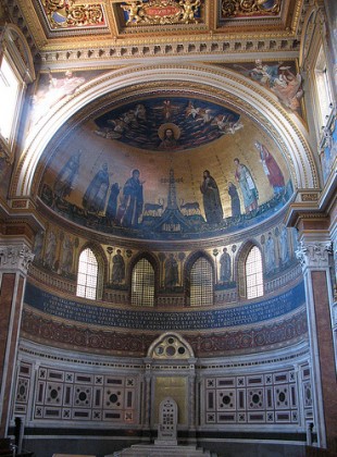
Here at a monumental scale is the apse of St. John Lateran where we find the Pope’s cathedra, and in the half dome above, God the Father, Son, and Holy Ghost.
It wouldn’t make much sense at all if the cathedra or the depictions of God were located to the side, with objects of lesser importance taking the central position.
Third Law: Physical Relationships Suggest Ideal Relationships
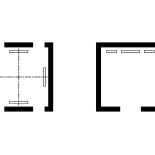
This third law is really an extension of the second law in the sense that the arrangement of things tells us something about the real relationships among those things. In the diagrams below, for example, the placement of the objects suggests a dialogue among equals (on the left), and a father-and-sons relationship (on the right).
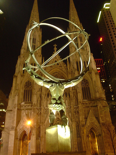
 Here is the third law writ large with Atlas at Rockefeller Center in New York opposite St. Patrick’s Cathedral. The two appear to be in some kind of profana conversazione. The placement of Atlas was intended originally to illustrate that the Church and industry cooperate with one another for the benefit of mankind; however, considering the overpowering size of Rockefeller Center, it can also appear to be a secular challenge to the Church’s authority.
Fourth Law: The Ideal Diagram Can Be Modified to Suit Circumstance
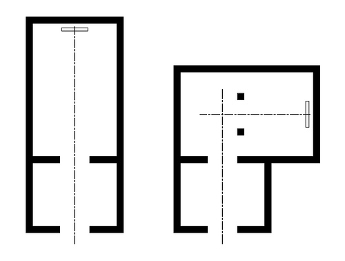
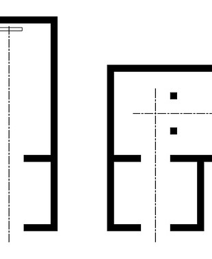
When circumstances do not permit the diagrams of laws one through three to be executed in a simple way, the diagrams can be modified and yet remain recoverable. For example, let’s imagine that we want to execute the diagram shown on the left: a simple procession through a vestibule to a room with an object on center. However, our site is too small to accommodate such a plan. To solve the problem we transform the diagram as shown on the right so that it fits on the site, yet still gets the point across. In this case, two objects (they could be columns, or urns, or sculptures, etc.) are located in such a way that the processional path is redirected.
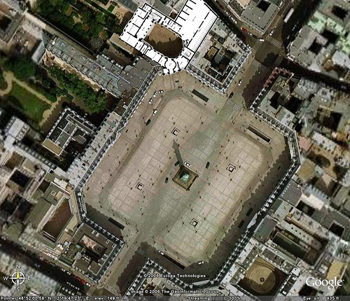
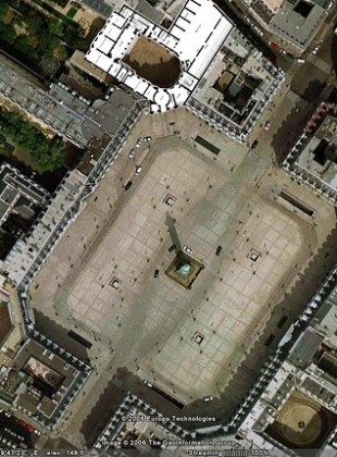
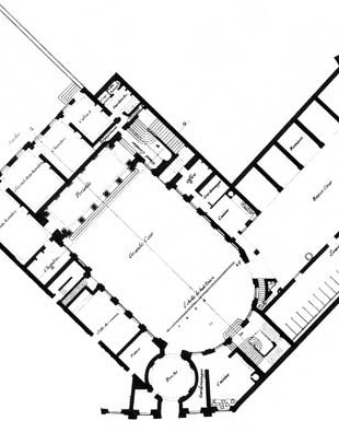
And here is the same principle applied expertly at the Place Vendôme in Paris. I’ve superimposed the plan of the Hôtel d’Evreux at the north end.
The plot of land was not orthogonal to the plan of the square, so the architect had a problem: how to frame a clear procession from the front door, through the house and courtyard, to the garden beyond? The solution was to modify the diagram through the clever use of an apse at the end of the courtyard. Here is the plan at a larger scale.
Upon entering the courtyard, one sees that the entry into the apsidal end is symmetrical with the entry to the service court opposite; however, the center of the apse is given to the stair hall to the southeast. The processional axis has shifted! At the other end, effectively terminating the public procession, is a loggia. A brilliant re-centering.
To get to the garden, the architecture signals that one must cross over into the private part of the house: at each end of the loggia, a new axis at right angles to the axis of the public court takes us in. To the southwest one enters an ante-chamber through a door which is symmetrical with another door at the other end of the room, which in turn leads us to a new axis joining the rooms which overlook the garden. (Note that in each of these rooms, the hearth occupies center.)
The plan is a veritable symphony of the laws described above. Moving through it, one always remains oriented and aware of the place of each piece as a part of the whole.

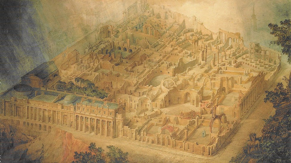
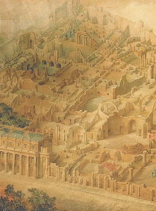
This famous watercolor by Joseph Gandy of Sir John Soane’s Bank of England depicted as a ruin effectively reveals the clever plan which takes full advantage of the laws described above.
Tags: architecture, design







Very nice and usefull, thanks for the enlightment.
I'm happy you enjoyed it!