First Law: Living Structure
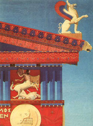
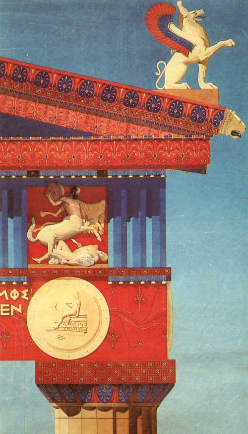
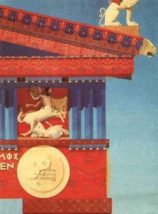
Before there is architecture there is mere building: posts, beams, roofs–no symbolic content whatsoever. The moment you need a monument, however, a merely functional building will not do. So you take those basic structural elements, the post, the beam, and the roof, and you transform them into something beyond the functional. First and foremost you make the building come alive–literally. Flip through an architectural history textbook, and everywhere you will see living things: flowers, leaves, tendrils, claws, paws, scales, eggs, heads, and even full figures, animating the structure of the most important monuments.
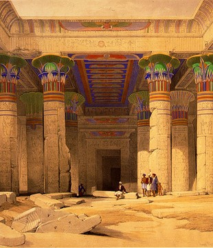
So a column is no longer just a post, it is a bouquet of lotus buds, or papyrus calyces, or palm fronds, lashed together and miraculously holding up a roof, such as these fine examples from Egypt:
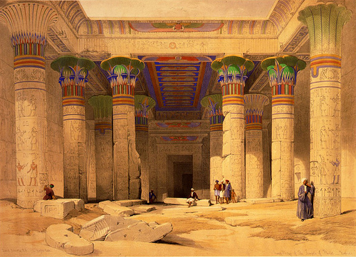
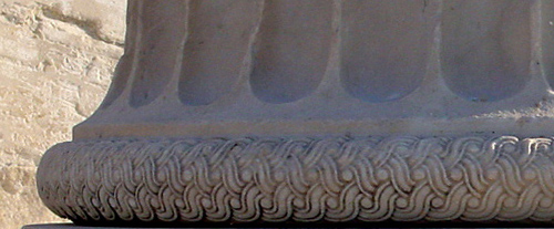
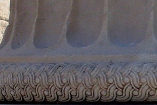
The lotus flower was chosen not by chance but because it symbolized creation and resurrection. Non-organic elements, like ropes, woven baskets, chains, etc. occupy distinctly supporting roles. Here an elaborate rope keeps everything together on a Greek column base:
The Greeks, who gave birth to our civilization, spent centuries working, distilling, enriching, and refining two basic column types, the Doric and the Ionic. They invented the Corinthian order as well, but the Romans really were responsible for developing it fully. And over the centuries, from antiquity, through the middle ages, to modern times, other columns which don’t fit easily into those three basic types have been produced as well. All follow the same basic pattern: they breathe life into dead construction, and turn prosaic structure into poetry.
Second Law: Moldings and Visual Statics
There are often times when not every element can be fully elaborated. Contrast among the parts is lost and the whole looks an even gray, particularly when the elements are sculpted rather than painted. Contrast improves legibility. In addition, there are humbler areas of a building which do not merit full elaboration (e.g., the service entrance). So detail is omitted. The result is the bare molding.
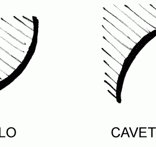
A lot can be done with moldings as they are highly suggestive in and of themselves. Look back at the chart by Frank Chouteau Brown hereto remind yourself of the inherent properties of these shapes. Why are these properties inherent? Take the ovolo and the cavetto, for example.
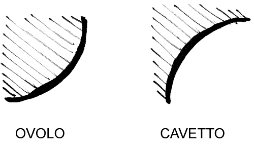
Imagine now that these shapes have been carved out of a block of stone. You can see at a glance that the ovolo is a more robust form as very little stone has been carved away–it appears strong enough to take a load. The cavetto, on the other hand, is more delicate–a lot of stone has been carved away, and if one were to set a load on top of it one can imagine the fragile tip snapping off. So the very forms themselves suggest support and crowning. The other moldings exhibit similar properties. The play of these properties is called visual statics.
Now let us go back to our humble structural post and see what can be done with it.
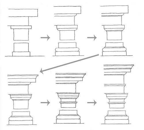
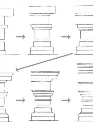
Let’s start with a simple post, beam, and roof (in upper left hand corner of the above illustration–note that I’ve truncated the post). To begin, we add a plinth underneath the post to spread its weight over a larger area. Without it, we will have the feeling that the post could pierce into the earth. Up top, we add a cap, or abacus, so as to preempt the feeling that the beam might shear. The juxtapositions of the post and the abacus and of the post and the plinth are rather abrupt, however, so in stage two we add a few moldings to mediate. Between the post and the abacus, we add an ovolo whose form visually suggests support, and between the post and the plinth we add a torus, whose form suggests binding and cushioning. Between the beam and the roof we add another supporting ovolo.
It’s looking a little better, but more could still be done to harmonize the transitions. In stage three, we add fillets at each ovolo to punctuate and provide that much-needed contrast. In stage four, we add crowning elements: a cavetto to the roof (or corona), and a congé to the abacus. In stage five, we add still more refinements. And finally in stage six, we add the finishing touches, most prominently a frieze separating the beam (or architrave) from the roof (or cornice) to provide us with a place to tell a story. This is where you commonly find bas-relief sculpture depicting some important persons or objects, or a lapidary phrase or two.
Thus can the Tuscan order (a humbler variation on the Doric) be derived, purely in response to the eye’s demand for harmonious transitions, contrast, and clarity. Now, all this does not mean that only supporting moldings can be located in supporting positions. It’s fairly easy to find important examples which contradict the laws of visual statics. Why? because the First Law is more important than the Second Law: architecture is not about actual structure but about a living, poetic structure which goes beyond what is physically possible.
Third Law: Hierarchy
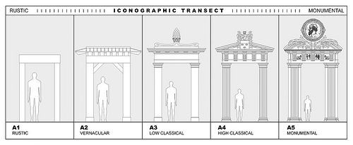
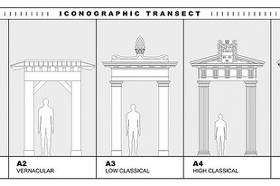
In primitive times, the architectural hierarchy was simple: the ruler’s Palace, Temple, and Tomb were highly elaborate, and everything else was as simple as could be. Over time, however, the picture became more sophisticated as the full hierarchy of offices which compose society asserted itself architecturally–the city was born. Since Roman times, you could line up the buildings of a city from least important to most important and derive a diagram that might look something like this:
At the humblest end of the spectrum you have buildings with absolutely no symbolic content whatsoever–they are purely practical structures, like barns and temporary shacks. At the most monumental end, buildings are laden with symbols, their scale is grand, they are constructed of expensive materials, they are labor intensive, etc. etc. These are the most important buildings which house the most important institutions in a polity. And in between, you have smooth a gradation, e.g., a Senate building is more important than a public library which is more important than a middle class dwelling.
Fourth Law: Thresholds
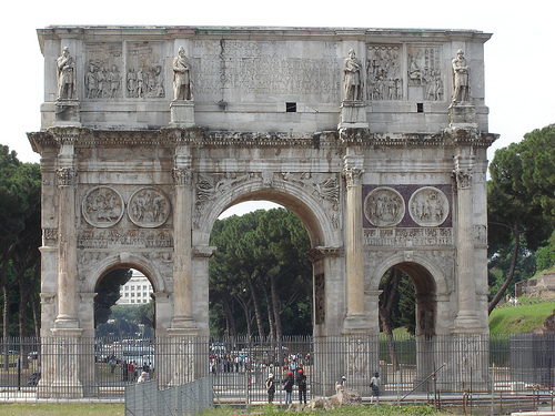
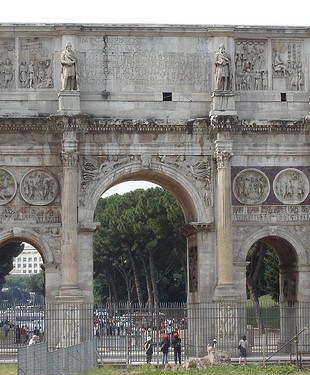
The city is essentially a collection of rooms. I hinted as much in our discussion of the Hôtel d’Evreux, which is really a collection of rooms attached to the more important room, the Place Vendôme, and the streets and squares beyond. As we pass from one room to another, we cross a threshold. Here is a very famous threshold, the Arch of Constantine:
Its purpose was to announce to the Roman citizens that, thanks to Constantine’s victory over Maxentius, he could lead them to a new, better world on the other side.
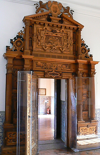
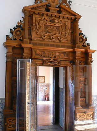
Every threshold is like the Arch of Constantine in that it announces the world that lies beyond. Not all of them are this grand. Here is the door which leads to the royal chambers in Philip II’s palace, El Escorial:
Every building facade is a threshold. Each announces the nature of the institution housed by the building, and its status relative to the other institutions which populate the city.
Fifth Law: Building Types
A church should look like a church. A library should look like a library, etc. This law needs no explanation.
Summary
The elevation (in proper coordination with the plan, of course) announces what is important and what is not so important to the people of a particular place. So if the architecture is doing its job, an alien from Mars should be able to tell how a particular society is constituted without anyone having to say a word or post a sign. Architecture, as opposed to mere building, keeps us oriented, both physically and temporally, telling us where we have come from, and where we are going.
Very interesting post. In fact I have enjoyed all of your posts so far. Please continue.
Excelent, simple, concrete and very understandable.