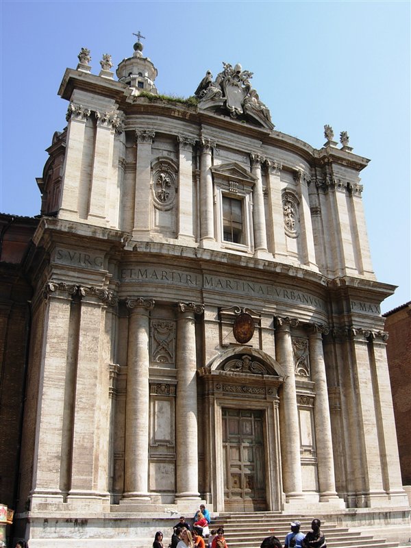
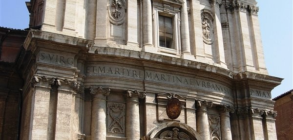
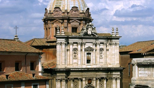
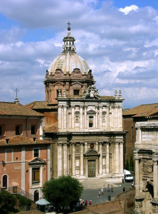
This in my opinion is the most beautiful facade in all of Rome. It is the church of Saints Luke and Martina, by the great Pietro da Cortona, and it will make your heart skip a beat. It positively oozes Roman gravitas and austere grandeur. So muscular without being flamboyant, so robust it borders on forceful, yet it is reserved.
It is perhaps under-sculptured, admittedly. What, no statues of either Saints Luke or Martina? I wouldn’t mind some color in there as well–either mosaics or panels of stone of varying hue. (Let’s blame those absences on the theological currents of the 17th century which were giving frank appeals to the senses a hard time.) However, the brilliant massing articulated with dense detailing carry the day.
Yes, facades can be “read” in much the same way as a building’s massing. There are three basic parts to this facade: two piers at each side, and a slightly convex center bay. Now look at it (in person, if possible, after a strong cappuccino) and try to sympathize physically with its general shapes. You should be able to feel its posture within you. (Might take some practice.) The center bay feels like it is swelling out, the way your heart feels when you swell with pride.
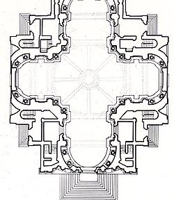
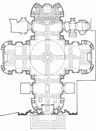
There is also a feeling of restraint, however, conveyed by the flattening out of the center bay. If you pass through that front door, you will find yourself at the end of the nave in a semi-circular apse. So the facade gives the impression that it is holding back the internal pressure of the apse inside as if out of a sense of modesty. Look at the articulation of the center bay. The columns and pilasters seem to be doing the work of holding back the apse all the while standing at attention to maintain a sense of decorum.

Plan of Saints Luke and Martina. Note how the center bay of the facade (bottom) “expresses” the apse inside.
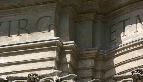
The articulation of the piers enhances this sense that the center bay is exerting outward pressure. See how the pilasters multiply where they meet the apse? Additional actors had to be deployed in order to keep the apse in check, as if it might spring out.
The apse is pushing out, the columns push back, and the piers are pressing in. There is a real struggle there! And it is designed to prepare you emotionally for the spiritual struggle that lies beyond. This emotional appeal is typical of Baroque art and architecture, and why it is so popular.
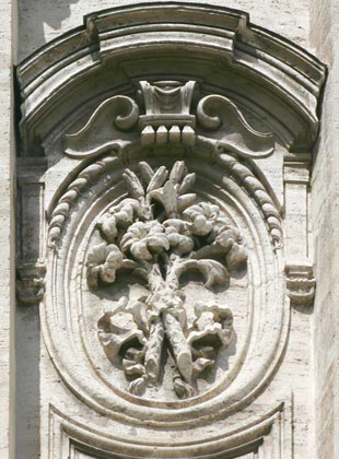
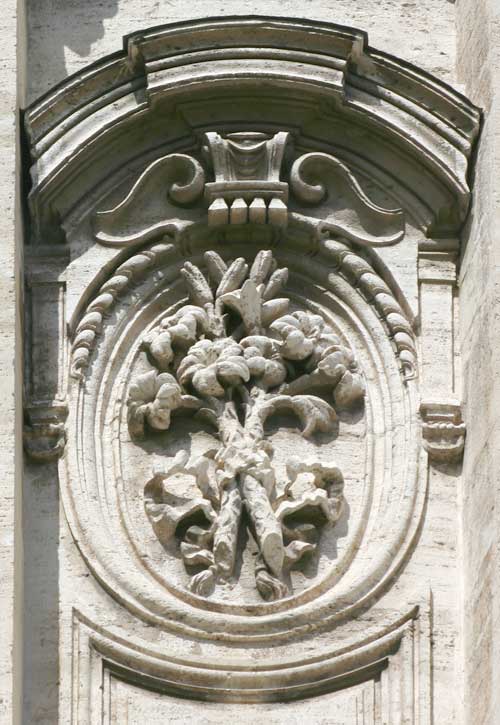
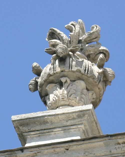
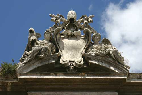
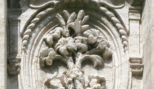
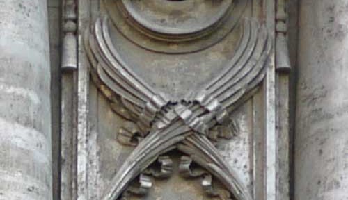
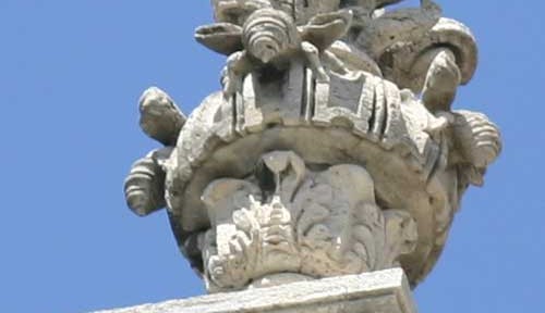
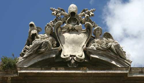
Once drawn in emotionally, of course, one’s intellect naturally wants to get involved. So the facade offers specific symbols to tell us what it is all about. The words in the lower frieze tell us, “Urban VIII, Pope, [dedicated/dedicates] [this church] to Saint Martina Virgin and Martyr.” Urban VIII, the patron, was of the noble Barberini family whose symbol was the bee, so you will find lots of bees strewn about the facade. Why no mention of St. Luke? Well, the church on the site had been dedicated to St. Martina since the 7th century, and was only given to the Academy of St. Lukein the 16th century when it was rededicated to include St. Luke. So perhaps out of reserve, he was given second billing, and iconography related to St. Martina predominates:
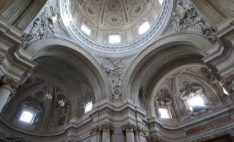
The facade also prepares you formally, introducing the architectural motifs which will be developed inside. The apse has already been introduced. The lower story of columns match the columns of the interior, and the shorter upper story corresponds with the vault of the ceiling.
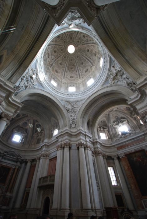
The crossing surmounted by a dome. Even the most subtle forces are expressed and resolved.
[Image source]
The structure continues to be articulated as the facade is: with clusters of columns, pilasters, and other details deployed with subtle articulation to suggest compression and relief, conflict and resolution. The facade is like an overture to an opera: it introduces the audience to the themes, the rhythmic variations, the style of conflict and resolution which will be employed throughout to help tell the story.
More than an overture, the facade is a large threshold which introduces one to the world that lies beyond. This is true not only for church facades, but for all facades, right down to the most humble abode. The facade of Santi Luca e Martina is a most instructive model for all. Like all good facades it draws one in emotionally, communicates to the intellect, and presents a coherent formal composition. And thus, it is rightly called beautiful.
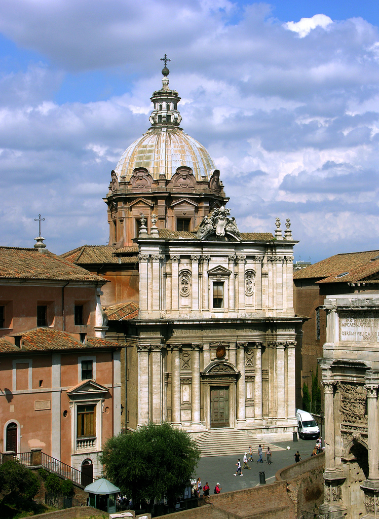
The facade in context, surrounded by other thresholds.
[Image source]
