Paul Goldberger, architecture critic for the New Yorker and long-time Notre Dame Driehaus Prize juror, gives a positive review of the Burj Khalifa, the insanely tall tower in Dubai. He says it
should be an easy building to loathe, and the embarrassing way that its completion coincided with the near-meltdown of Dubai’s economy makes it easy to mock as a symbol of hubris. And yet the Burj Khalifa turns out to be far more sophisticated, even subtle, than one might expect. The tower is a shimmering silver needle, its delicacy as startling as its height. You would think that anything this huge would dominate the sky, but the Burj Khalifa punctuates it instead.
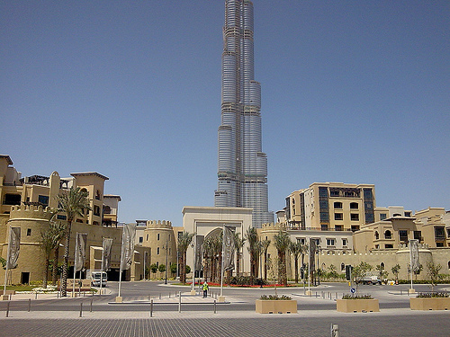
I’m not exactly sure what that is supposed to mean. I have not been to Dubai in person, but the photo provided on the New Yorker website suggests that the tower does indeed dominate–and overwhelmingly so. How could it not?
The building’s massing is admittedly elegant; however, it seems to have nothing else to offer, certainly nothing close to the buildings to which Goldberger compares it:
The Woolworth Building, the Chrysler Building, and the Empire State Building, each of which was the world’s tallest for a time, were all put up to announce the primacy of their city to the world, and they succeeded. That’s just what Asian and Middle Eastern countries are trying to do now. You don’t build this kind of skyscraper to house people, or to give tourists a view, or even, necessarily, to make a profit. You do it to make sure the world knows who you are.
The Woolworth Building, the Chrysler Building, and the Empire State Building all contribute to the life of the street. The pedestrian has a place near them. They are all appointed with ornaments and decorations which communicate their respective roles in the city. I cannot say I love the idea of the skyscraper, but these buildings are clearly urbane.
The Burj Khalifa, on the other hand, fails on all counts. Goldberger essentially admits as much when he says, without irony, that the tower “looks best from afar.” The farther the better! Skyscraper design, it seems, has become reduced to massing. The rest is utterly predictable and hostile to civic life.
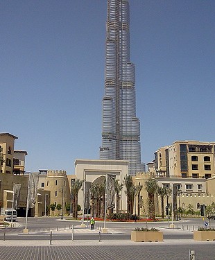
Far more interesting, though still far from perfect, is the Old Town development, shown here in the foreground.
The website’s blurb says:
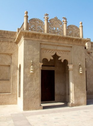
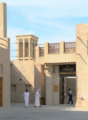
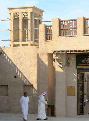
Architectural cues are taken from traditional buildings, including the Al-Bastakia neighbourhood of Bur Dubai and the residences of Sheikh Saeed Al-Maktoum and Mohammed Shareef Boukash – with textures that reflect the gypsum, clay or sarjool plastering used in the early twentieth century. Earthy natural tones reflect the surrounding landscape. Terraces, balconies, parapets (waresh), pergolas, recesses and niches make for comfortable outdoor living, whilst views are enhanced with elegant window and door openings.

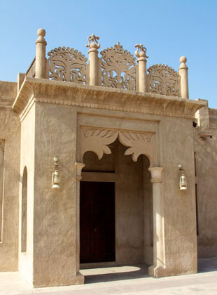
Al Bastakiya, a historic district in Dubai, United Arab Emirates
(Image Source)
Now these people are on the right track! The city wall is definitely cheesy and over the top; however its inclusion is certainly an understandable response to a healthy impulse. Perhaps its also a way to mitigate the modernist zoning laws. Judging by the cited Al-Bastakia precedent, with the right combination of zoning and design, Dubai (“a cross between Hong Kong and Las Vegas”) has plenty of patrimony to draw upon to achieve much more than it has with the Burj Khalifa.
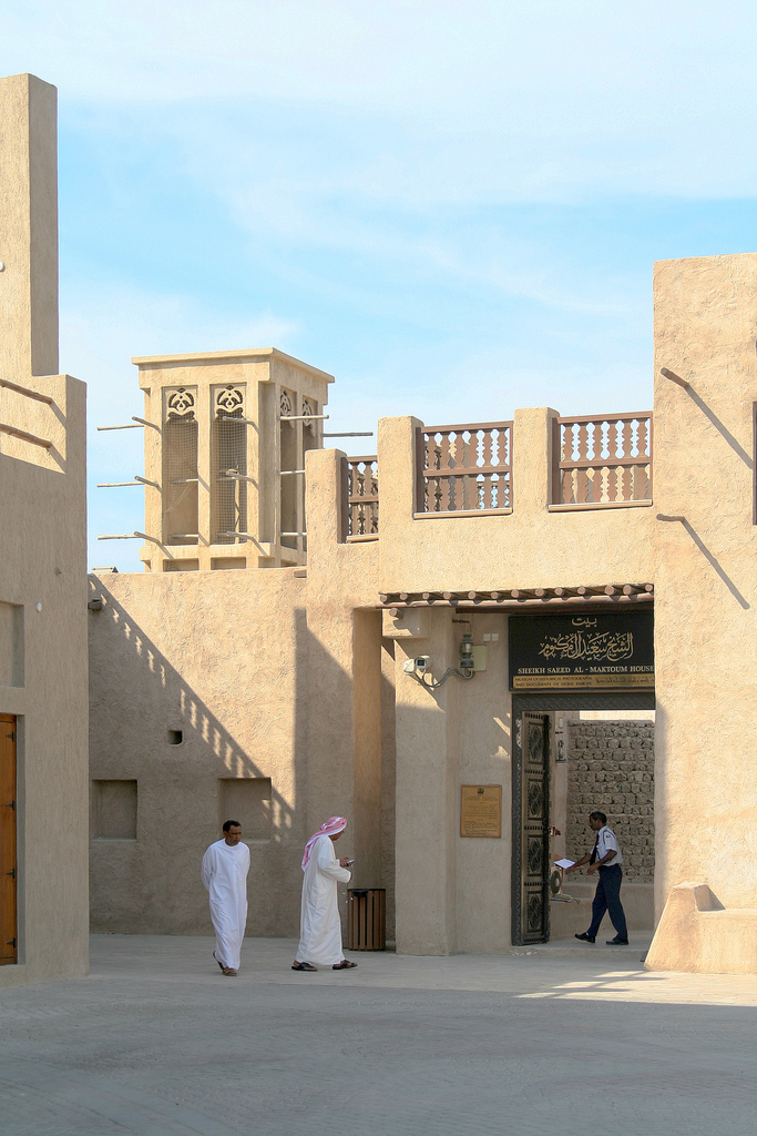
The house of Sheik Saeed bin Maktoum Al-Maktoum
(Image Source)
