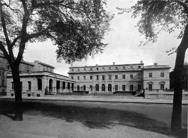
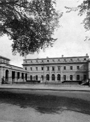
Henry Clay Frick was a college dropout and a hated industrialist, but he built perhaps the most magnificent of all residences on the rocky isle of Manhattan. Designed by Thomas Hastings to hold Frick’s expanding art collection, he willed that the house should become a public gallery on the death of his wife. And thus we have the Frick Collection today standing at the corner of Fifth Avenue and 70th Street.
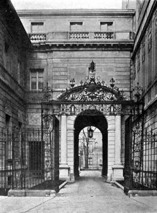
Modifications have been made to it over the years, none of them grotesque. Regrettably the gorgeous porte-cochere was demolished, but such was necessary to make way for John Russell Pope’s excellent addition, completed in 1935 for the opening of the gallery. And in 1977 John Barrington Bayley, bucking all trends for which the 1970s are rightly stigmatized, designed the bookshop and garden. Not exactly Michelangelo, but come on, it was the 70s. Worryingly, Davis Brody Bond has done work on a planning study. We certainly hope they don’t do to the Frick what they did to the Harvard Club.
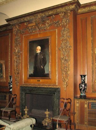
Last Wednesday, Paloma and I and our Yale students enjoyed the privilege of a group tour graciously conducted by the Frick’s Chief Conservator Joseph Godla. The house is truly a work of art in its own right. By all means, go to the Frick to see the excellent collection of paintings, sculpture, and decorative objects. You may want to go several times to take it all in. But save one trip to see the building itself. My mind reels at the thought of the number of wood and stone carvers who must have been employed to pull this off. Here are a few of the photos I took of their splendid work.
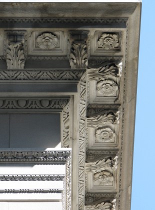
Though the pilasters on the Fifth Avenue side are Ionic, the entablature is a florid Corinthian. Note that the modillions, the small brackets holding up the corona in the cornice, are more elaborate than they would be in an Ionic entablature. Hastings wisely alternates carved bands with plain bands to relieve the eye and to provide contrast.
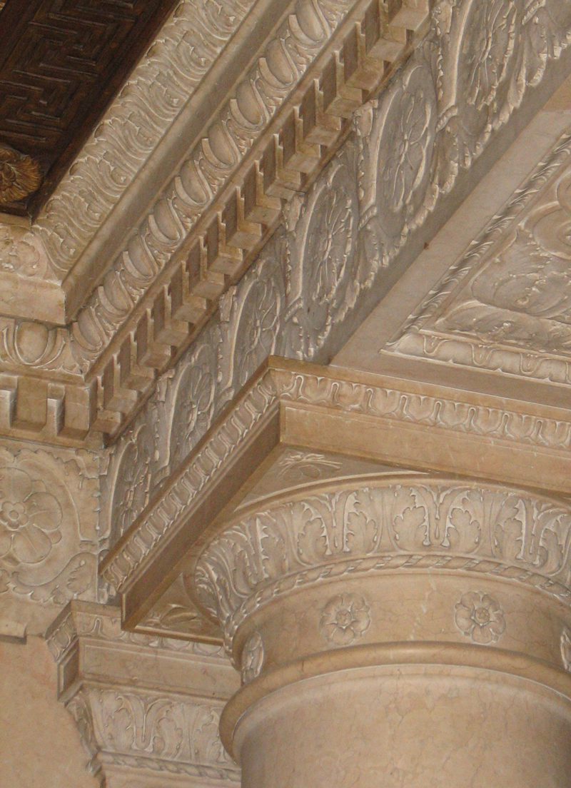
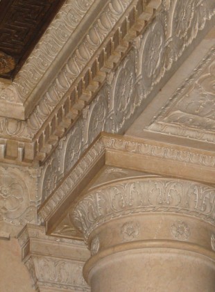
Inside the house, where there is little direct light, the detail can get more intense. Here we have a fully developed Doric capital, leaves in the echinus carved as the Romans would have done, rather than painted in the Greek manner. In the entablature above, the architrave has essentially been omitted, with just a frieze and an abbreviated cornice above. The carving is subtle but sumptuous.
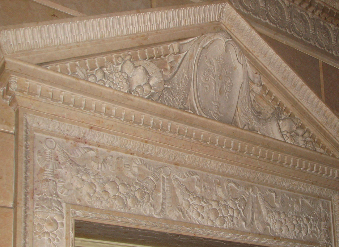
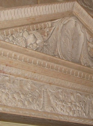
An overdoor with festive details and symbols of domestic abundance and hospitality.
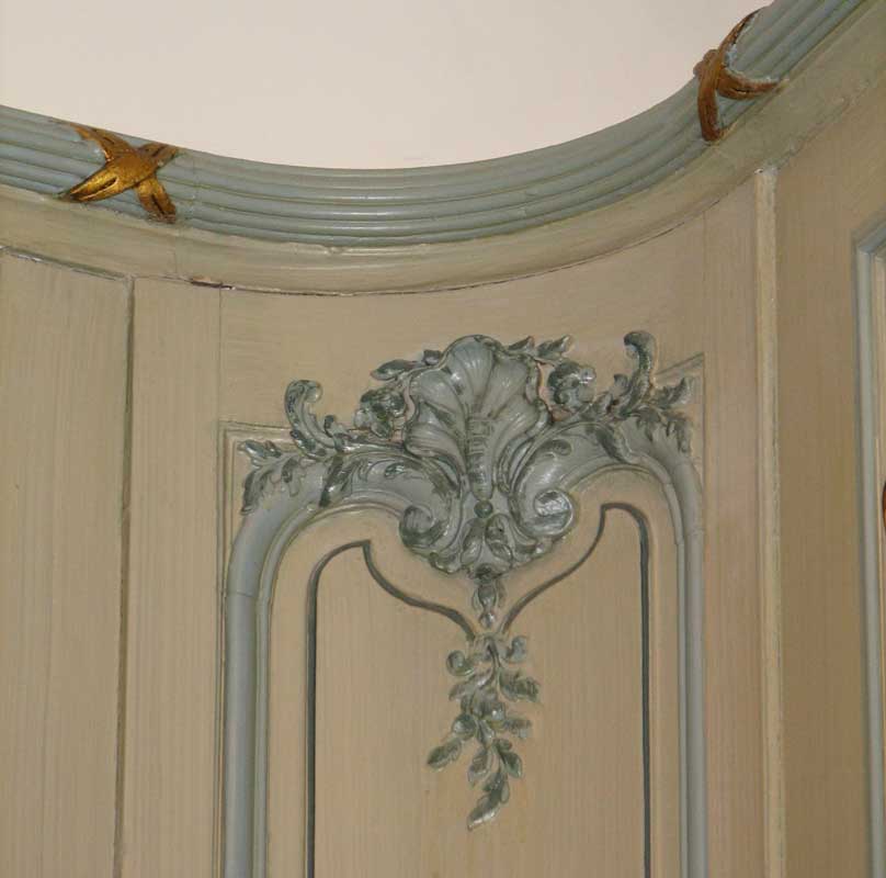
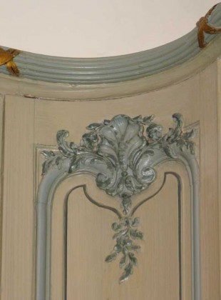
In the Boucher Room, paneling is made to come alive in a way only the French could pull off. The sticking peels away from the top of the stile and curls into a tendril where shoots sprout around a sea shell. The cornice crowning the room is as simple as could be: the warmest, most nonthreatening fasces motif ever carved.
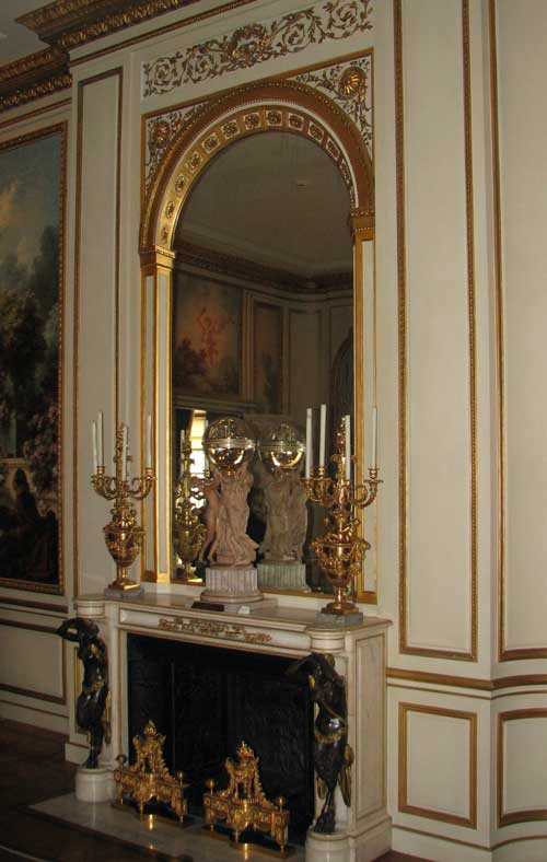
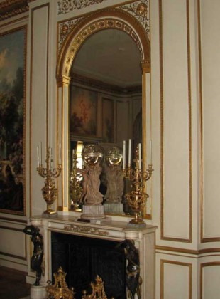
A spectacular gilded chimney breast. The arched frame around the mirror looks a foot deep thanks to the false perspective. The chimneypiece with chimeric caryatids in supporting roles, is an antique.
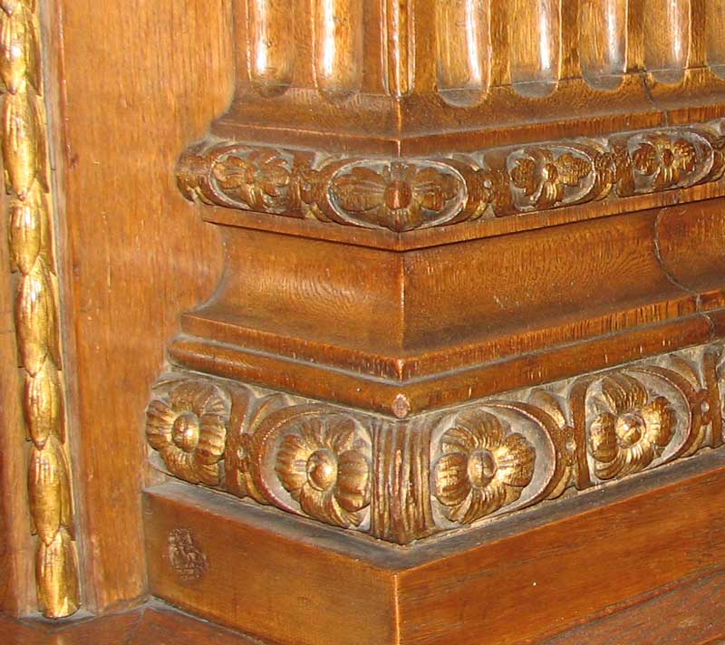
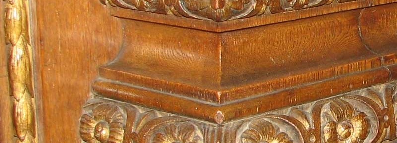
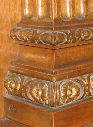
A finely carved attic base, with flowers inserted into a guilloche motif. To the left, where a lesser architect might have designed a simple bead molding, Thomas Hastings specified a string of gilt lotus buds. Note that gilding of vegetal forms is always matte, never polished, as otherwise the form’s definition is lost and the result is gaudy.
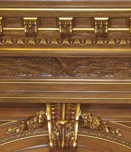
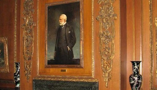
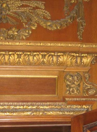
More expertly handled gilding in this overdoor. That’s about the lushest acanthus bedmold I’ve ever seen, I think. The console motif to the right is an excellent way to reduce the cornice’s overhang, formally necessary, sometimes, so as not to overlap the next panel.
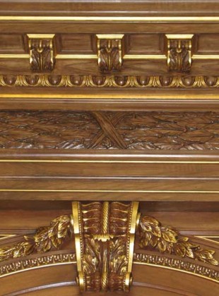
In the keystone above, note that the gilding on the flat fillets is polished, while that on the leaves remains matte and strategically placed so as to pick up highlights. The frieze is pulvinated (that is, it bulges out slightly), and is ornamented with imbricated laurel leaves.
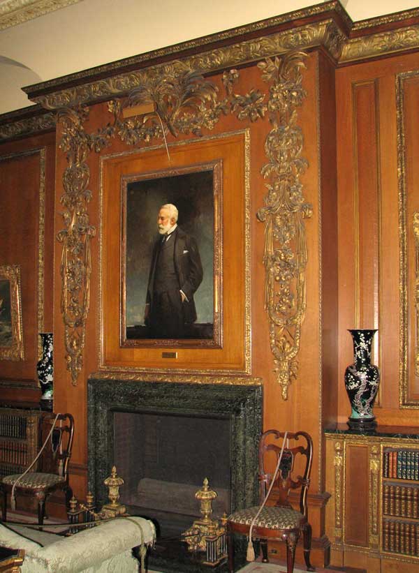
Now this is a library, with a place by the fire to smoke a pipe, catch up on one’s reading, and leave the troubles of the steel industry far, far away.





Thanks for the little tour. It’s overwhelming I had to get my dictionary. Regretfully I probably won’t get to the Frick any time soon. But I have been to St Augustine and seen Carrère and Hastings’ Ponce de Leon hotel, now part of Flagler College. It’s so wonderfully over the top. It’s as if it’s as if it arrived from another time and place. The more you look the more there is to see. Carrère and Hastings knew how to cultivate the right clients.
They also had a great range. The Ponce de Leon hotel is impressive.
[…] be “simple, in good taste, and not ostentatious.” Architectural critic Dino Marcantonio calls the house a work of art in its own right, worthy of its own […]